

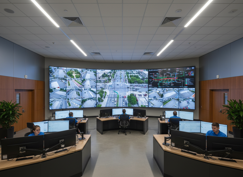
A smart city nerve center display should help traffic, public safety, and utilities share one readable municipal view, not just fill a wall. The right setup depends on room geometry, farthest-viewer distance, source complexity, and how often teams need to switch between live feeds, alerts, and maps. If the wall looks impressive but makes it harder to scan, it is the wrong fit for a smart city nerve center display.
Why Cities Need a Nerve Center Display
A municipal nerve center has a different job than a standard control room. It is often where separate departments need to see the same situation at the same time, compare priorities, and hand off responsibility without losing context. That is why a smart city nerve center display has to support shared situational awareness, not act like a single-dashboard broadcast screen.
In practice, the planning question is simple: what must stay visible, what can rotate, and what should never be buried behind decorative layout choices? The common operational picture in city operations matters because traffic, safety, and utility teams do not make decisions from the same feed set. A purpose-built display layer makes that coordination easier to plan for, even though it does not guarantee better outcomes on its own.
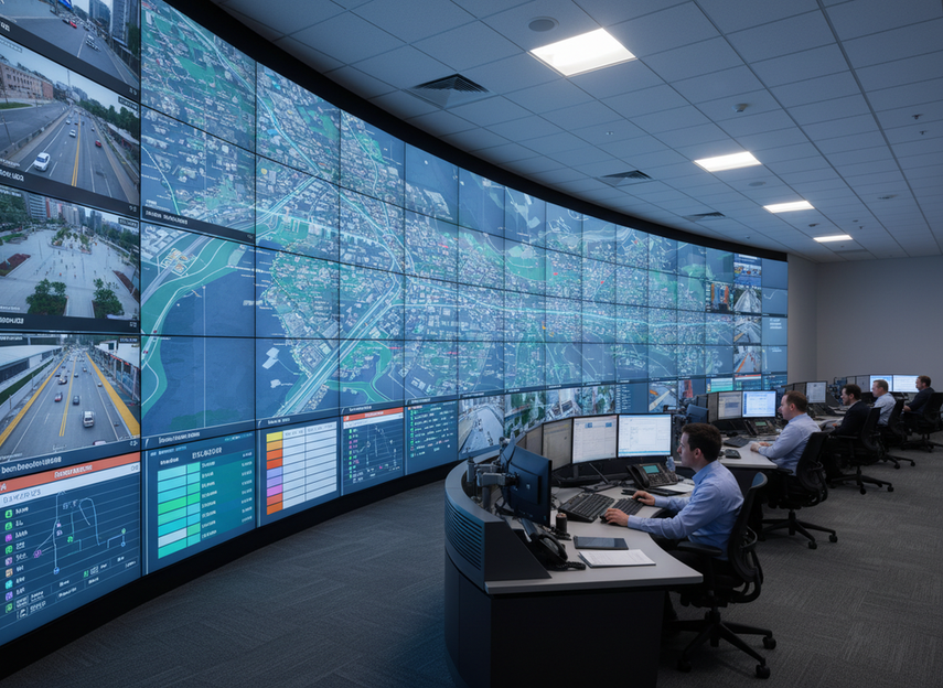
If your room only serves one team or one narrow task, a generic control-room layout may be enough. If the room is meant to support cross-department monitoring, incident review, and shift handoff, then the display architecture needs to be planned around shared visibility first.
Architecture Choices for the LED Wall
For most cities, the first architecture decision is not brand or cabinet style. It is whether the wall fits the room, the viewing distances, and the operator workflow. ISO 11064 on control-room ergonomics and sightlines supports the idea that control centers should be laid out around operator performance, room geometry, and shared display access. AVIXA’s viewer-distance-based display sizing adds a practical rule: the farthest viewer should help determine image size and pixel pitch, because the back row is what exposes a layout that is too fine or too small.
That means the wall should be specified from the room out, not from the product in. A compact municipal room with close operators usually needs finer detail and tighter layout control. A deeper room can tolerate broader spacing, but only if maps, alerts, and camera feeds remain legible where the farthest user sits.
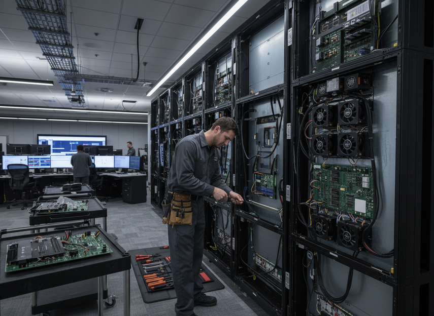
Service access also matters. Front-service maintenance paths, modular replacement, and sensible cable routing are not glamorous, but they are the difference between a room that can be maintained and a room that becomes disruptive every time a panel needs attention. In mission-critical rooms, redundancy planning for power and signal paths is a design consideration, not a promise of zero downtime.
A useful decision sentence: if the wall has to serve mixed teams at different distances, prioritize readability and service access before you optimize for density or visual impact. If the room is small and the closest operators handle detail-heavy work, the recommendation flips toward finer image structure and tighter sightline control.
Layout and Viewing Distance
The layout should match how people actually face the wall and how often they glance between the wall and their consoles. A display that is readable from the front row but hard to parse from the farthest seat will create uneven performance across the room. That is why the viewing-distance logic matters more than the display’s nominal size.
For command-style rooms, this usually means checking the farthest operator position first, then deciding how much fine detail the wall needs to hold without pixelation becoming a distraction. The practical question is not "how big can we make it?" but "what size keeps the whole room equally usable?"
Signal and Source Integration
A city operations center rarely lives on one feed. The wall needs to accept GIS layers, cameras, incident tools, utility status panels, and occasional briefings without forcing the operator into a rigid sequence. That is where city operations center video wall integration becomes a workflow issue, not just a cabling issue.
If every source is treated like a permanent priority, the wall gets cluttered fast. If every source is hidden behind rotation, operators lose the context they need during incidents. The right answer is usually a layered one: keep the most important feeds persistent, rotate secondary context, and give alerts a clear visual lane.
Serviceability and Redundancy
In a 24/7 municipal environment, serviceability is part of the architecture. Front access, simple module replacement, and predictable maintenance paths reduce the chance that normal upkeep turns into room downtime. Redundancy planning is still worth specifying, but it should be described as a precaution, not as a guarantee of uninterrupted operation.
If procurement language promises resilience without explaining how the room is maintained, that is a warning sign. The safer approach is to verify the power, signal, and access assumptions before the wall is approved.
Room Constraints and Expansion
A wall that fits today’s seats but leaves no room for future operators or new source zones can become expensive later. For that reason, room geometry and expansion headroom should be part of the first design conversation, not a late-stage adjustment. If a city expects new departments or more data layers later, a scalable layout is usually easier to live with than a perfectly filled wall that cannot change.
How Data Fusion Shapes the Visual Layer
A smart city nerve center LED wall has to do more than show multiple feeds. It has to organize them so the room can read the city quickly. Harvard Data-Smart City Solutions shows how layered urban data visualization can combine GIS, sensor data, incident dashboards, and operational context into a common view. That is the right model for a municipal wall: layers should be visible, but not equally prominent.
What this means in practical terms is that traffic maps, public safety alerts, and utility status panels should not compete for the same visual weight. The most urgent item needs stronger placement, but the broader operating picture still has to stay visible. If the wall makes every element equally loud, it becomes harder to see what changed first and what needs attention now.
For example, a traffic layer may stay visible as a base map while incident markers pop forward. Utility status may be kept in a stable side zone, and camera feeds may rotate when the room is in routine monitoring mode. The content rules matter because too many feeds can overwhelm operators and flatten the priority order.
That is the main trade-off in smart city data fusion visualization: more context is not automatically better. If the wall is trying to show everything all the time, the operator may spend more time sorting than deciding. The better design is usually the one that keeps the highest-value layers persistent and gives lower-priority feeds a controlled rotation rule.
| Municipal condition | Setup implication | Planning note |
|---|---|---|
| Short viewing distance | Favor tighter detail and simpler layouts | Check legibility from the farthest seat, not just the front row |
| Mixed operations dashboard | Use clear zones and a stable priority order | Keep traffic, safety, and utilities visible without equal emphasis |
| Detail-heavy control use | Preserve enough space for maps, alerts, and camera feeds | Avoid layouts that force constant zooming or swapping |
| 24/7 critical operations | Plan for service access and cautious redundancy | Treat maintenance path planning as part of the wall design |
| High source rotation | Use defined rules for persistent and rotating feeds | The wall should support context changes without clutter |
Operator Workflow and Handoff
The wall should support a routine sequence that is easy to follow under pressure. A useful municipal workflow is: intake, review, prioritize, share, and hand off. That sequence is not a rigid SOP, but it does keep the room from becoming a collection of disconnected screens.
- Intake: Incoming feeds, alerts, and calls arrive together, so the wall needs a clear default layout that does not hide the first signal.
- Review: Operators verify what changed, which team owns the issue, and whether the event belongs in a persistent zone or a rotating one.
- Prioritize: The most urgent information moves to the highest-visibility area, while supporting context stays available but secondary.
- Share: Traffic, safety, and utility staff should be able to see the same operating picture without recreating it in separate tools.
- Handoff: Shift changes should preserve the display state so the next operator does not have to rebuild the room’s context from memory.
This is where shared visualization can reduce duplicate effort, but only if the source rules are clear. The wall should make it easy to pass the situation forward, not force each department to interpret a different version of the same event.
Choosing the Right Setup for Your City
| Municipal condition | Architecture implication | Planning note |
|---|---|---|
| Compact room with close operators | Favor tighter sightline control and finer display detail | Check the farthest seat first so the wall does not only work from the front row |
| Mixed-department room | Use clearer zoning and a stable priority hierarchy | Keep traffic, safety, and utilities visible without making every feed equally prominent |
| Heavy source switching | Plan stronger signal organization and defined rotation rules | The display should support context changes without making operators rebuild the wall |
| High-maintenance-access needs | Prioritize front service, cable discipline, and modular replacement paths | Maintenance should be possible without disrupting the room’s daily use |
| Future expansion headroom | Leave room for added seats or new data layers | Avoid layouts that lock the city into one fixed configuration |
If you are narrowing a shortlist, the main filter is room condition, not feature count. A city with a compact operations room and close viewers should favor a different setup than a larger nerve center with more departments and more feed rotation. A wall that looks flexible on paper may still be a poor fit if it cannot support the room’s actual viewing distance or maintenance path.
For readers moving from planning to product review, our mission-critical LED wall options are a useful place to compare a control-room-oriented path against broader indoor display choices. If your room leans more toward traffic visualization than general operations, the traffic and VMS solution path is a better browsing starting point. The right choice still depends on current room geometry and source mix.
Implementation Checks Before Deployment
Before procurement closes, verify the room dimensions, the farthest viewing distance, and the main operator sightlines. Then confirm which sources must stay persistent, which can rotate, and how alerts will appear during a live incident. A display that is only approved on paper can still fail in practice if the content hierarchy is unclear.
Also check maintenance access, service paths, and the training needed for the staff who will actually use the wall. If the room depends on a specific integration assumption, test it before final signoff. If you are comparing indoor fine-pitch options, review the room plan first, then confirm maintenance and source-layering needs before you commit.
FAQs
What Is the Use Case for a Smart City Nerve Center Display?
Its main use is to give multiple municipal teams one shared operational view. That makes it different from a presentation wall or a single-department dashboard. The best fit is a room where traffic, public safety, and utility staff need to see the same situation and make coordinated decisions from the same display layer.
How Does a Nerve Center LED Wall Differ From a Standard Control Room Video Wall?
A standard control room wall can be designed around one workflow, but a nerve center usually has more mixed sources, more handoffs, and more cross-department attention. That changes how the wall should be zoned, what stays persistent, and how much room the display needs to preserve context.
What Data Sources Should a City Prioritize on the Wall?
Start with the sources that change decisions fastest, usually live maps, incident feeds, camera views, and utility status panels. The key is not to show every possible feed at once. Prioritize by operational value, then decide which items stay visible and which can rotate without losing context.
Can One LED Wall Support Traffic, Public Safety, and Utilities at the Same Time?
Yes, if the layout is planned around hierarchy instead of equal emphasis. The wall should keep the highest-priority layers persistent while supporting secondary context in designated zones or rotations. The risk is not capacity alone, but attention overload if every department tries to own the same visual space.
What Should Cities Verify Before They Finalize a Display Architecture?
Verify room size, viewing distance, sightlines, source compatibility, maintenance access, and operator training. Also test the assumptions behind source rotation and incident layouts before signoff. A design that seems sound in drawings can still break down if the room’s workflow is not validated with the people who will use it.
When Does a More General Indoor LED Platform Make Sense?
A broader indoor platform can make sense when the room is not truly mission-critical, the source mix is simpler, or the city is building a flexible display environment instead of a tightly managed nerve center. If the room depends on strict handoff logic, service access, and persistent priority layers, a more specialized path is usually easier to justify.