

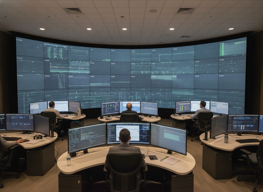
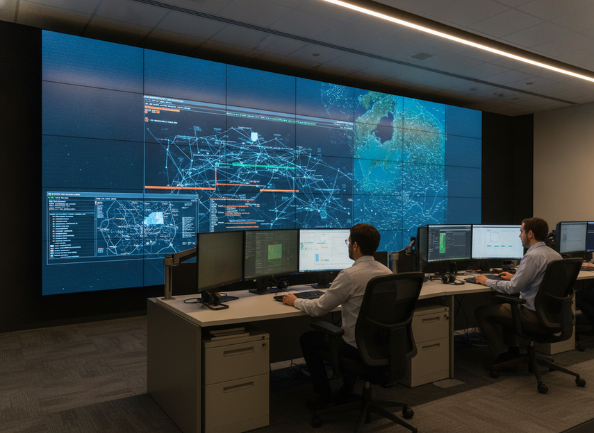
LED wall ergonomics is a real spec issue in 24/7 control rooms, not a soft preference. When operators read alarms, maps, and dashboards for long shifts, the wall has to fit the room, the seating plan, and the lighting plan. The right setup supports visual comfort and clear decision-making; it does not promise medical relief or fatigue prevention.
Why Operator Comfort Belongs in the Spec
In a control room, the display is part of the workstation. That is why control-room ergonomic design matters here: ISO 11064 treats displays and controls as an ergonomics problem, not just a hardware list. OSHA also notes that display placement and lighting can affect glare, awkward viewing postures, and visual fatigue in workstation settings, which is a useful U.S. reference point for display placement and glare.
For long shifts, the practical question is simple: can operators read what they need without fighting reflections, awkward angles, or tiny text? If the room is fixed around a wall, the wall has to match that room. If the room is still being designed, you can often improve comfort more by changing seating, lighting, and sightlines than by chasing a more expensive panel alone.
That is why LED wall ergonomics belongs in the first round of spec review. Comfort is not a bonus feature. It is part of whether the wall actually works for a 24/7 control-room team.
The Comfort Factors That Matter Most
The useful way to judge a wall is to separate the comfort variables instead of treating them as one vague idea. A buyer usually needs to check four things: legibility, off-axis consistency, glare control, and low-blue-light claims. Each one changes the decision in a different way.
Pixel Pitch, Viewing Distance, and Text Legibility
Pixel pitch matters most when the room carries dense text, alarms, or map-heavy content. In plain terms, tighter pitch usually makes fine detail easier to read at a given distance, while coarser pitch can make small UI elements look busier or less comfortable over time. A common planning heuristic is the "10x rule," which uses pitch in millimeters as a rough guide to minimum viewing distance in feet, but that should stay a rule of thumb rather than a universal standard.
What this means for buyers is straightforward: if operators sit close and read text all day, pitch becomes a comfort issue, not just a picture-quality issue. If the wall is mainly for broad status awareness from farther away, you may not need to push pitch as aggressively. The correct choice depends on the room, the content, and how often people are reading small details.
Viewing Angles and Off-Axis Consistency
Wide viewing angles matter when the room has supervisors, visitors, or multiple operator positions. A wall can look sharp from one centered seat and still feel uneven from the sides if brightness or color shifts too much. For a wide viewing angle COB command center, the real question is not whether a spec sheet sounds broad enough, but whether the wall stays readable across the actual seating layout.
In practice, this becomes a room-layout question. If everyone faces the wall head-on, off-axis behavior matters less. If the room is wide, shared, or supervised from several positions, stable image behavior across seats becomes much more important. That is why LED wall ergonomics has to be judged from the room plan, not from the front-row demo alone.
Anti-Glare Surface Choices
Glare is usually a room-system problem as much as a display problem. Windows, overhead lighting, glossy furniture, and reflective finishes can all make the same wall feel harder to use. OSHA’s workstation guidance is blunt about this: reflected light and excessive brightness can wash out the screen and make images harder to see, which is exactly why anti-glare LED display operator ergonomics is really about the wall plus the room together.
For buyers, the check is not simply "does the display have anti-glare treatment?" It is "how does the wall behave under our actual lighting?" A finish that helps in a bright room may soften fine detail a bit, so the trade-off is usually visibility versus crispness. That trade-off matters most in rooms with task lighting, daylight spill, or multiple reflective surfaces.
Low Blue Light Considerations
Low blue light belongs in the spec review, but it should be discussed carefully. IEC 62471 photobiological safety classification focuses on lamp and LED safety categories, which is a better anchor than medical-style eye-strain promises. Third-party programs such as eye-comfort certification can also help buyers verify low blue light, flicker, and reflection-management claims for extended viewing.
The key point is not that a label automatically makes a wall comfortable. It is that the label gives you one more verification cue. Check whether the feature changes color appearance, calibration workflow, or brightness behavior. In a 24/7 control room, that matters because comfort has to coexist with readable, consistent content.
How to Balance Comfort and Clarity
-
Start with the operator task. If the team reads dense dashboards all day, prioritize legibility and consistency. If the wall is mostly for supervisory awareness, broaden the focus to room-wide readability and off-axis performance. The best LED wall ergonomics choice changes with the job.
-
Set the viewing zones next. Map where people sit, stand, and walk. A setup that feels comfortable from one seat can feel wrong once you add side positions, visitors, or shift supervisors. This is where mission-critical command center options should be evaluated against the actual floor plan, not just the spec sheet.
-
Test glare and brightness in the room. Look at the wall with the real task lighting on, not only in a controlled demo space. If reflections or washout appear, the fix may be lighting control, surface changes, or seating adjustments, not only a different panel type.
-
Confirm calibration and service access. A wall that starts out comfortable can drift if brightness, color, or maintenance access are hard to manage. In a 24/7 room, the maintenance plan is part of ergonomics because unreadable content and delayed service affect the daily operator experience.
If you want a broader technical backdrop for product-side verification, our engineering and compliance note is useful for the documentation side of LED wall selection. It does not replace room testing, but it helps frame what to ask for during review.
Match the Wall to the Room
| Control-Room Condition | Ergonomic Priority | Spec Implication | Buyer Check |
|---|---|---|---|
| Dim room with dense text and alarm dashboards | Legibility and close-range reading | Favor tighter pitch and stable calibration so small content stays easy to read | Can operators read fine text from their normal seats without leaning in? |
| Glare-prone room with windows or glossy surfaces | Reflection control | Favor stronger anti-glare behavior and a lighting plan that reduces washout | What happens to contrast when daylight or overhead lights hit the wall? |
| Wide supervisory room with mixed seating positions | Off-axis consistency | Favor stable brightness and color across seats, not just a good center view | Does the image stay balanced from the farthest side seat? |
| 24/7 mission-critical room with service sensitivity | Maintainability and uptime | Favor access, calibration workflow, and documentation that support fast correction | Can the system be serviced or adjusted without disrupting operations? |
This matrix is the fastest way to avoid a common mistake: buying for the demo room instead of the control room. The same wall can be a good fit in one layout and a poor fit in another. If you are comparing commercial indoor LED options, use the room condition first and the product second.
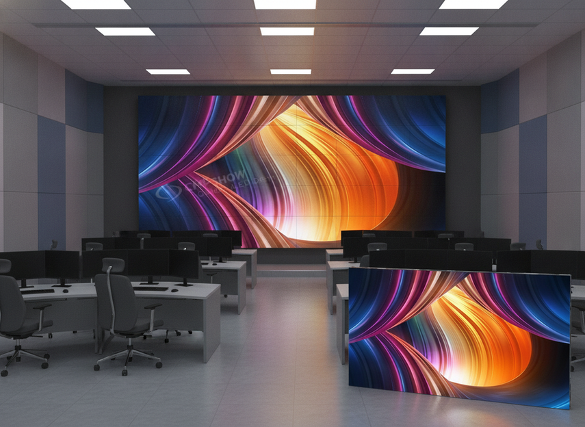
For COB-based designs, treat the comfort benefit as conditional, not automatic. fine-pitch COB display options can be a sensible fit where seating is close and off-axis viewing matters, but the room still has to support the finish, calibration, and content style. If the room is bright, reflective, or heavily text-driven, the wall choice can still miss the mark unless the lighting and viewing geometry are planned well.
Buyer Checklist for 24/7 Spec Review
Before final approval, confirm these five points together:
- Seating and sightlines: Does the wall work from the actual operator, supervisor, and visitor positions?
- Pitch and readability: Can the smallest routine content be read without strain from the normal viewing distance?
- Glare and lighting: Do the room’s windows, fixtures, and reflective surfaces create washout or reflections?
- Calibration workflow: Can brightness and color be maintained without making the wall harder to use?
- Documentation and service access: Can the system be verified and serviced without disrupting the room?
For low-blue-light claims, keep the check practical. Review the stated safety or certification basis, then ask how the feature affects color, calibration, and extended-view comfort. The point is to verify support, not to assume a label is enough.
If you are shortlisting now, compare the room conditions first and the product family second. Our zero-downtime COB wall and other mission-critical command center systems are best reviewed against the actual seating layout, lighting, and content mix before you approve the spec.
Final Takeaway
The best LED wall ergonomics choice is the one that matches the room, the task, and the shift pattern. For 24/7 control rooms, that usually means checking legibility, glare, off-axis performance, and low-blue-light claims in the actual seating plan rather than relying on the spec sheet alone. If you are narrowing options now, use the checklist above to rule out mismatches before you compare models.
FAQs
How Do You Choose an LED Wall for Extended Shifts?
Start with the task the operators do most often. If they read small text all day, prioritize legibility, glare control, and stable brightness across the seats. If the wall is mainly for situational awareness, widen the focus to room-wide readability and viewing-angle consistency. LED wall ergonomics is easiest to judge when you begin with the work, not the brochure.
What Makes a Display Easier to View Across a Control Room?
A display is easier to use across a room when it stays consistent from multiple positions. That usually means stable brightness, stable color, and readable content from side seats as well as the center. The room layout matters just as much as the panel spec, because a wall that looks uniform head-on can still feel uneven off-axis.
Why Does Anti-Glare Matter in Operator Rooms?
Anti-glare matters because reflections can wash out images and make details harder to read. But the display finish is only one part of the answer. Windows, overhead fixtures, glossy desks, and room color all change how the wall behaves, so buyers should evaluate glare control as a room-and-wall combination.
Can Low Blue Light Be Part of a Comfort Spec?
Yes, but only as one part of the review. Low-blue-light features can help support extended-view comfort, yet buyers should also check whether the feature changes color accuracy, calibration, or overall image behavior. Use certification or safety classification as verification, not as a promise of fatigue reduction.
What Should Buyers Verify Before Final Approval?
Confirm seating layout, sightlines, pitch, room lighting, calibration workflow, and service access together. If any one of those is ignored, the wall can look good on paper and still feel tiring or hard to manage after installation. That last check is often where LED wall ergonomics is won or lost.